General
How to Design App UI With AI: A Practical Workflow
A working method for turning a plain-text app idea into polished UI screens with AI, then refining them into something you can actually ship with your team.
TL;DR: The fastest way to design your app's screens before hiring a designer is to describe the app to TapUI, an AI mobile app designer. Write one sentence on who the app is for, the main job and the feel you want, and it builds up to 8 matching screens on one design system. Refine single elements, then paste the screens into Figma or download PNGs to show investors, users or the designer you hire. Plans start at $20/month ($17/month billed yearly). The rest of this guide is the workflow: get specific, prompt in four parts, commit to one direction, build the flow, and review like a skeptic.
The first screen an AI gives you is rarely the one you ship, and that is fine. AI is fast at producing a version of your idea, so you spend your energy reacting and refining instead of staring at an empty artboard.
The founders and PMs who get good results from AI design tools are not better designers. They are better at describing what they want, and they iterate without mercy. This guide is that workflow: from a sentence in your head to a set of mobile screens you would be comfortable handing to a developer.
No design background needed. If you can describe an app to a friend, you can do this.
Designing your app before you hire a designer
You do not need a designer to get your first screens. You need screens good enough to test the idea, and AI gets you there in one sitting:
- Write the one-sentence brief. Who it is for, the main job, the feel. "A budgeting app for freelancers that feels calm, with a monthly overview, invoices and a tax pot."
- Generate the core flow. In TapUI, one prompt returns up to 8 connected screens (onboarding, home, a detail screen, settings) on one design system.
- Fix what is wrong, not everything. Rewrite single elements (a headline, a button, a chart) instead of regenerating whole screens.
- Show it to real people. Download PNGs, or a ZIP of every screen, for a pitch deck or a user interview. No watermark.
- Hand it to the designer you hire. Paste the screens into Figma as editable layers. A designer who starts from your flow instead of a blank brief saves you days of back-and-forth.
When to bring in a designer: once the idea survives real users and you need a brand, a design system you own, and the edge cases (empty states, errors, accessibility). AI gets you to a credible draft. A designer makes it yours.
Cost check: TapUI Starter is $20/month ($17/month billed yearly) for 100 screen generations. Uizard is free for 2 projects ($12/month billed yearly after that), Google Stitch is free in Google Labs, and Figma's Starter plan includes up to 500 AI credits a month.
Before you open any tool
Vague input wastes more time than any tool. "A finance app" gives the model nothing to work with, so it returns the blandest average of every finance app it has seen, and you regenerate five times looking for a design you never described.
Spend five minutes getting specific. You need rough answers to three questions:
- Who is it for, and on what device? A budgeting app for students looks nothing like one for small-business owners. iOS first, Android first, or both?
- What is each screen's one job? What is the primary action? On a dashboard, which number does the user want at a glance?
- How should it feel? Calm and trustworthy reads very differently from bold and energetic. Two or three adjectives steer the whole look.
You do not need a spec. You need enough that your first prompt is not a coin flip.
Picking the right kind of tool
"AI design tool" covers different categories, and the wrong one costs you a weekend. Match the tool to what you need at the end:
| Category | What it gives you | Use it when |
|---|---|---|
| Image generators (Midjourney, DALL·E) | Static images, concept art | You want mood and inspiration, not editable screens |
| AI UI generators (TapUI, Google Stitch, Uizard) | App screens you can edit and hand off | You want mobile UI to refine and hand off |
| Code-first builders (v0, Framer) | Working code and deployable pages | You are building for the web and want to ship the result itself |
If you mostly work on the web and want a deployable page at the end, a code-first builder like v0 serves you better than a screen generator. Image generators make beautiful concept art that you cannot edit component by component: fine for a pitch deck, frustrating for real design work.
Where TapUI fits: it is built only for mobile app UI. Describe the app in plain language, pick a visual direction, and it generates up to 8 connected screens on one design system, which you can refine element by element and export to Figma, HTML or PNG. It does not build web pages; for a live site, use a code-first tool.
Writing prompts that work
A good prompt covers four things. Most prompt-engineering advice overcomplicates it. The model needs:
- Context: what the app is and who uses it. "A mobile fitness tracker for iOS."
- Style: the visual direction. "Clean, modern, dark mode."
- Components: what is on the screen. "A dashboard with weekly activity rings, a workout history list, and a button to start a new workout."
- Constraints: the specifics that pin it down. "Neon green accents on charcoal, minimal icons, generous whitespace."
Put those together and you get a usable screen on the first or second try instead of the tenth.
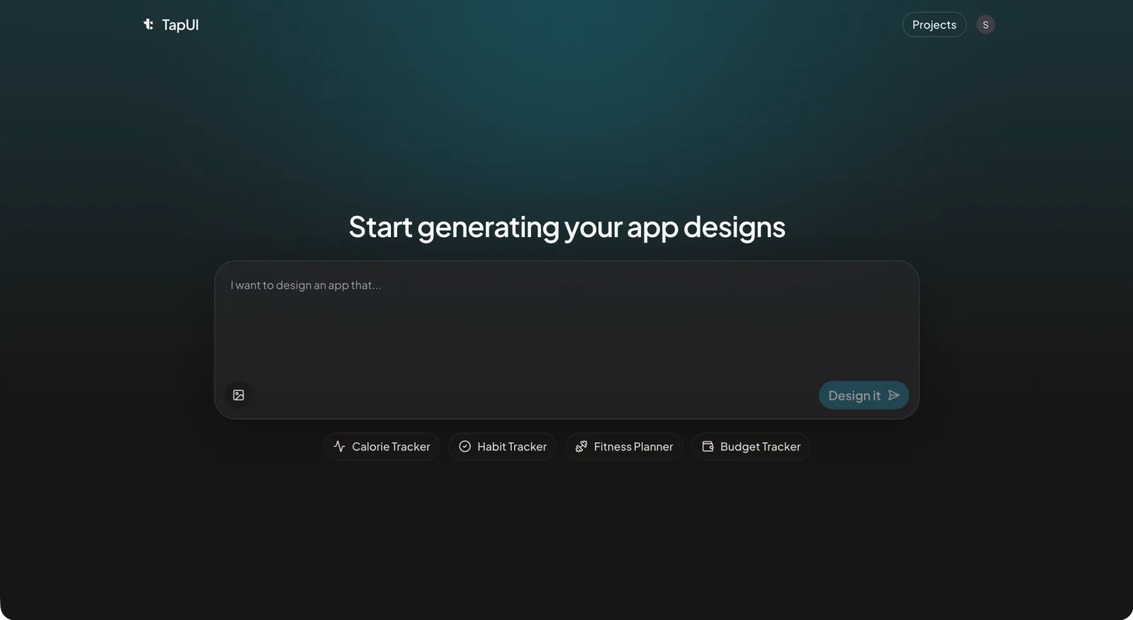 Describe your app in plain language in the TapUI Studio prompt box, and it generates polished mobile screens you can refine.
Three habits help every time:
- Swap vague adjectives for decisions. "Blue" is a guess; "deep navy" is a decision. "Modern" could mean anything; "flat with soft shadows" means something.
- Name a reference. "Card layout like Airbnb" or "a dark theme like Spotify" says more in four words than a paragraph.
- State your non-negotiables. If you care about comfortable touch targets or strong text contrast, say so. The model will not add accessibility on its own.
Resist the giant prompt. Start lean, see what comes back, then add detail. Building up from a simple result is much easier than untangling an overstuffed one.
The workflow
Here is the loop, end to end.
1. Explore wide to find a direction
Generate a few variations from a broad prompt before judging anything. Look for directions you would not have thought of, and save the ones that are almost right. AI is strong at this stage, so let it surprise you.
2. Commit to one direction and sharpen it
Pick the closest variation and write a sharper prompt that names exactly what you liked. The second pass is usually far more cohesive than anything from the first round. That jump is why iteration matters.
3. Build the flow in one style
List the app's real views (onboarding, login, home, a detail view, settings) and generate them in the same style. TapUI builds up to 8 connected screens at once on one design system, so the flow stays consistent. With tools that design one screen at a time, generate each screen separately and reuse the same style description, because asking a single-screen tool for ten screens often produces ten slightly different design systems.
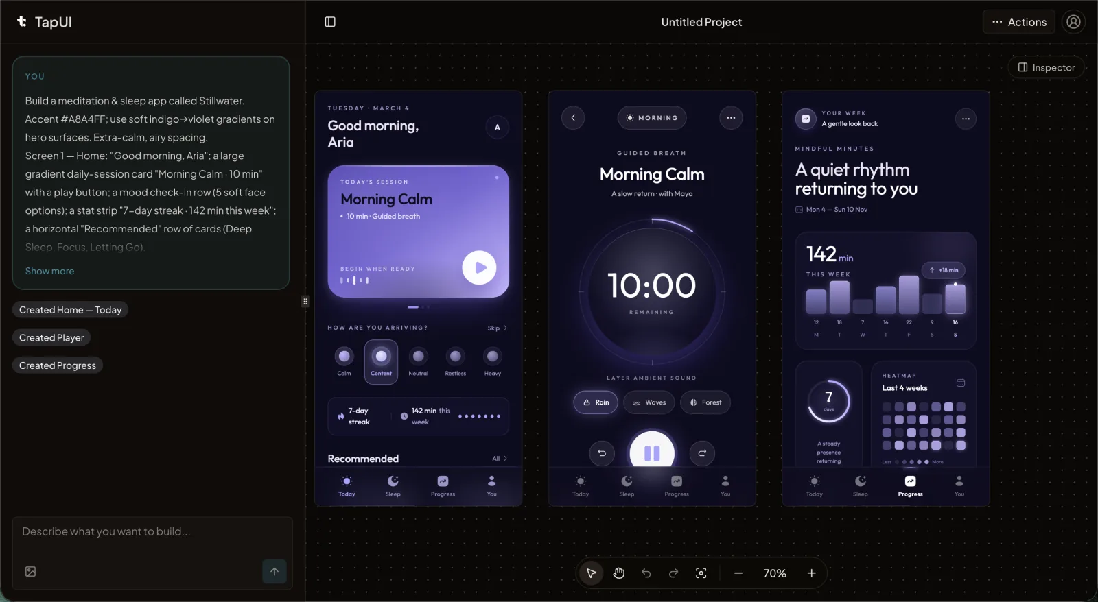 Refine each screen in the editor so the whole set shares one consistent style.
4. Review the results like a skeptic
Check accessibility yourself; the model does not apply accessibility standards reliably. Review every screen for:
- Text contrast that is comfortable to read (aim for WCAG AA, 4.5:1 for body text).
- Touch targets large enough to hit without aiming (roughly 44×44px).
- State shown by more than color alone, with an icon or label alongside.
- Platform conventions, not a generic mix of iOS and Android.
Then test it with real content. AI fills screens with tidy placeholder text, but real names overflow and real descriptions run long. A layout that only works with perfect dummy data is not finished.
5. Hand off to whoever builds
Once the screens hold up, get them in front of the people building the app. Export images for stakeholder review and give developers the screens as their reference.
The screens that matter most
Some screens carry more weight than others, and which one matters most depends on the app (a finance dashboard, a dating profile, a checkout). In general:
Onboarding should teach the app's value in three or four slides, one idea each, with a clear way to skip. Ask for a "matching illustration style" across slides to keep them consistent.
Dashboards are about hierarchy. Decide the single most important metric and make it the largest thing on screen; group the rest into cards. Users spend the most time here, so design for a quick glance, not for cramming in features.
Forms are where attractive AI output most often hides poor usability. Label every field, show validation clearly, and cut every input you do not need. Walk through the flow yourself, because a beautiful form that is annoying to fill out has failed.
Keeping it consistent
Consistency separates a polished app from a stitched-together one, and you have to enforce it.
Keep a short style reference and reuse it in every prompt: your exact colors as hex values, a few type sizes, a spacing scale, and your button and corner-radius styles. Pasting "navy #1a237e and coral #ff6b6b, 16px base spacing" into each generation does more for coherence than regenerating and hoping.
If your tool offers saved style presets, use them. Before you call anything final, put the screens side by side. Mismatched colors and uneven spacing are obvious in a row and invisible one screen at a time.
Mistakes that cost beginners the most time
- Overstuffing the first prompt. You can always add detail; you cannot easily simplify a confused result.
- Ignoring the platform. iOS and Android have different conventions. Name your target so you get the right navigation, sheets and system fonts.
- Accepting the first result. The first generation is a starting point. Combine the best parts of a few passes.
- Designing for placeholder data. Test with the messy, variable-length content your app will hold.
- Treating accessibility as optional. Small touch targets and weak contrast exclude real users. Check every time.
Where AI helps and where it doesn't
AI speeds up the production of design, not the thinking behind it. It is excellent at execution: generating layouts, applying a style, producing variations on demand. It is weak at what decides whether an app is good: understanding who it is for, framing the real problem, and making judgment calls an average cannot make.
You still need to know what you are building and for whom. What you get back is hours of manual screen work collapsed into minutes of describing and refining, which for most founders and product teams is exactly the part worth automating.
FAQ
How can I design my app's screens with AI before hiring a designer?
Describe the app in one sentence to an AI mobile app designer such as TapUI. It builds up to 8 matching screens from that prompt, lets you edit single elements, and exports to Figma, HTML and PNG, so you can test the idea with users and give a designer a head start. TapUI starts at $20/month ($17/month billed yearly).
Can AI design a complete app UI from a text description?
Yes. TapUI turns a one-sentence description into up to 8 connected mobile screens on one design system, which you can edit and export to Figma. You still decide who the app is for and what each screen needs to do.
What makes a good prompt for AI UI design?
Cover four things in order: context (what the app is and who uses it), style (the visual direction), components (what is on the screen) and constraints (specifics like exact colors and spacing). Start lean and add detail over a few rounds rather than cramming everything into one prompt.
Does AI handle accessibility automatically?
No. Review every result yourself: check text contrast (aim for WCAG AA, 4.5:1 for body text), confirm touch targets are roughly 44×44px, and make sure color is not the only way you show state.
How do I keep multiple AI-generated screens consistent?
Generate the flow together when your tool supports it; TapUI builds up to 8 screens at once on one design system. Otherwise, reuse a short style reference in every prompt (hex colors, type sizes, spacing scale, button and corner styles), use saved presets if available, and review the screens side by side before calling anything final.
Can I hand AI-generated designs to developers?
Yes. Export images for stakeholder review and give developers the screens as their reference. TapUI exports to Figma, HTML and PNG; your developers build the app in whatever framework you use.
Try it on something small
The fastest way to learn is to design one screen. Redesign the login or home screen of an app you use every day: write a four-part prompt, generate a few options, sharpen your favorite, and run it through the review checklist above. You will understand the whole loop in under an hour.
TapUI Starter is $20/month ($17/month billed yearly) for 100 screen generations, and Pro is $40/month for 650. Start with TapUI and turn your app idea into screens you can show this week.